Make it stand out.
NCSA WEB DESIGN
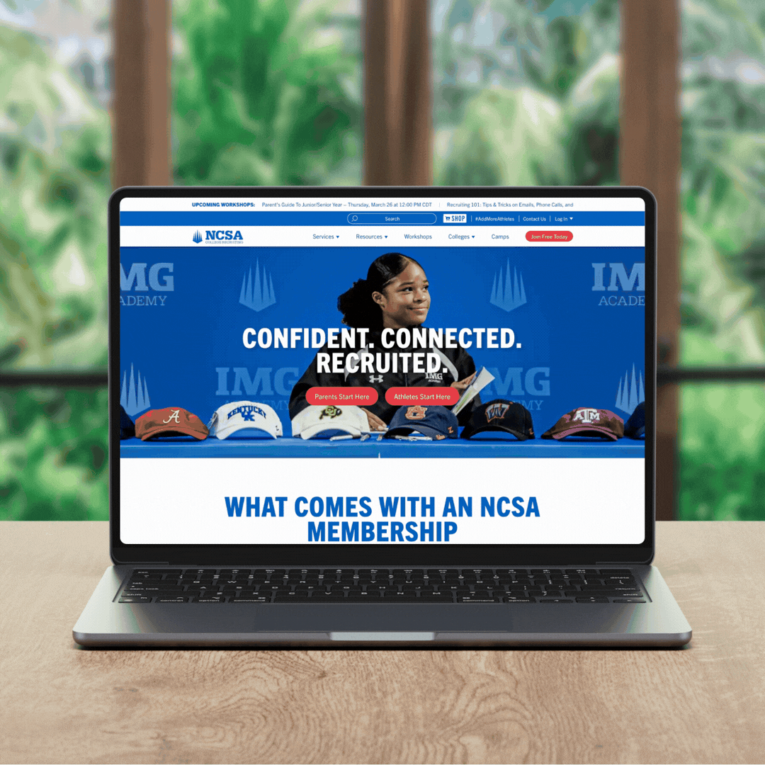
The NCSA homepage is always being tested and iterated. The goal is always to show potential customers the benefit of an NCSA membership and to get them to convert. We tell a story of our athletes who have been recruited to college and our experts who helped them along the way.
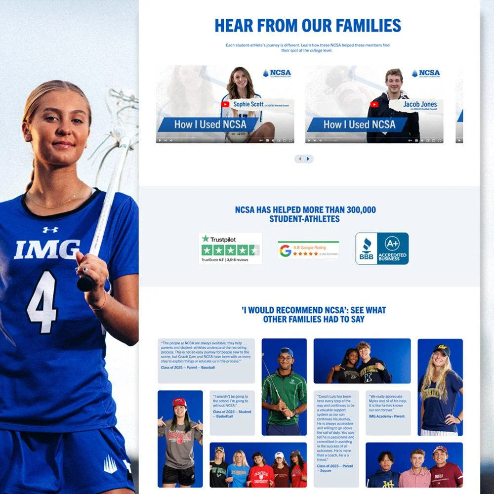
Like most reviews pages, NCSA's reviews page goal is to create trust with our potential consumer. The different sections tell the stories of our committed athletes in different ways: video so they can hear the voices of families that have used the services, external trust stats on sites like Google and BBB, and written reviews.
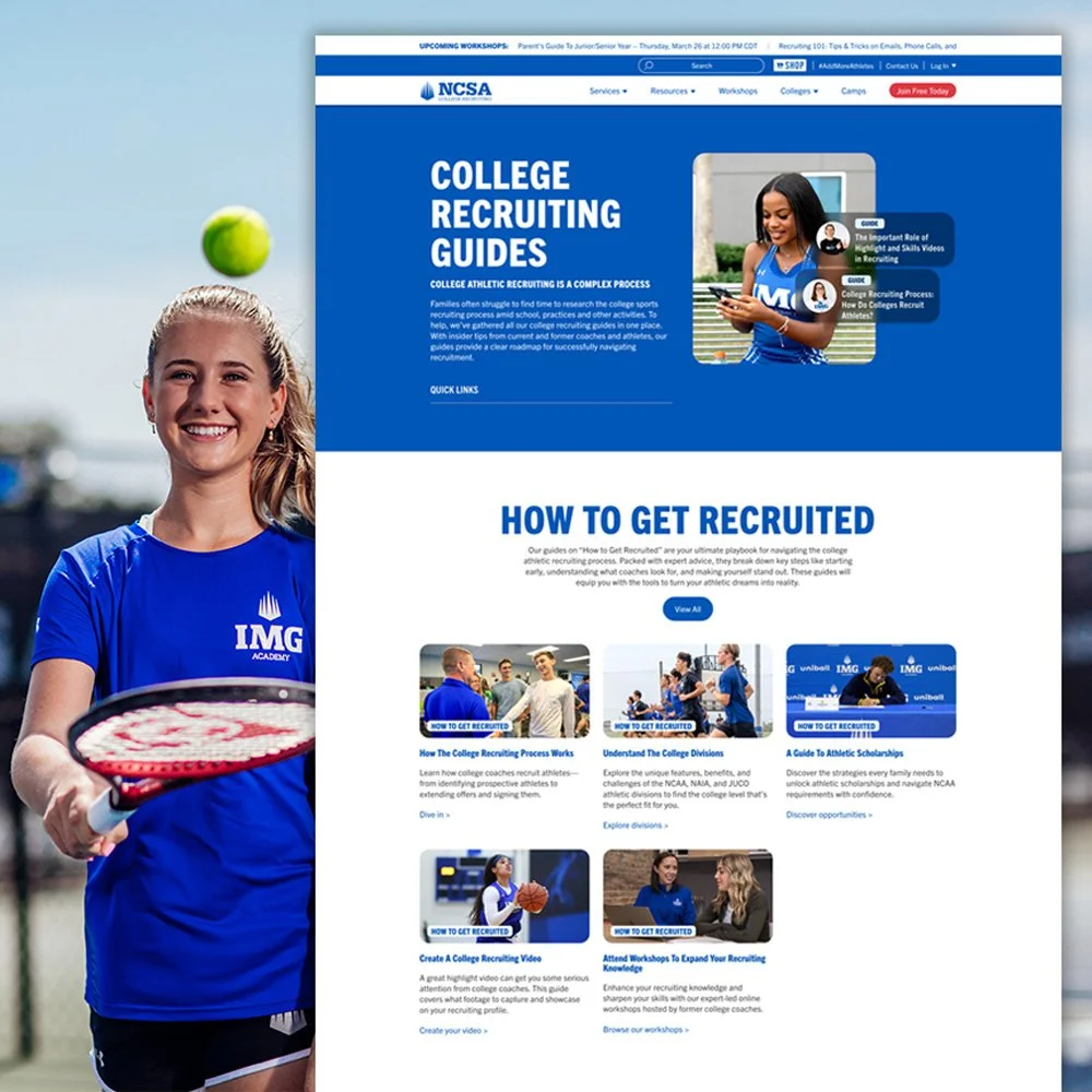
NCSA prides itself on educating their audience and this page serves as a portal to different educational guides and resources that users can use in their recruiting journey. Jump links at the top of the page make it easy for users to navigate to the guides most important to them.
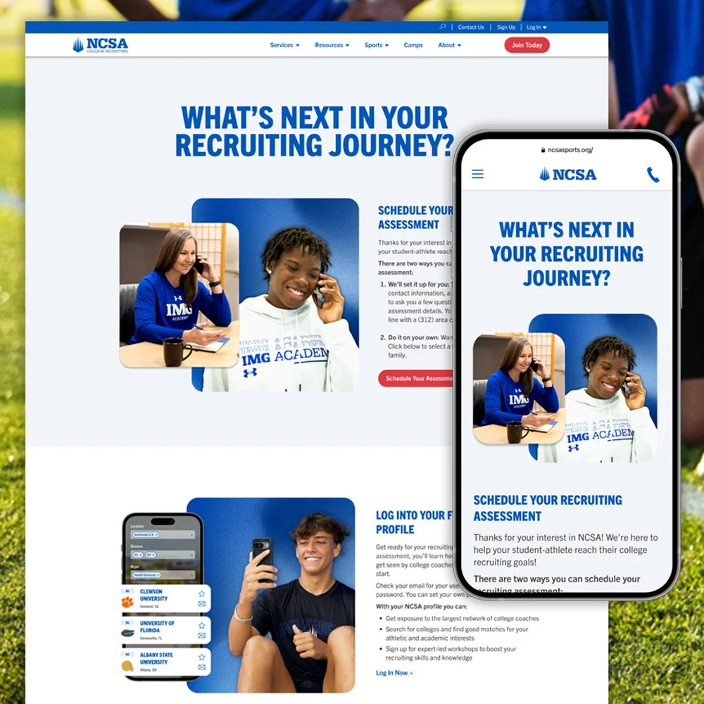
This is a post sales lead landing page that helps our sales team convert by scheduling a call. The page takes the user, step by step through what to expect on the call and why a membership would benefit them.
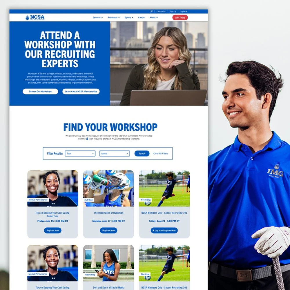
After Covid, online workshops with out recruiting coaches became a top revenue stream for NCSA. The team created library of both live and on-demand workshops for users to find through a filtered search. This page continues to perform well and we are always adjusting design elements through testing.
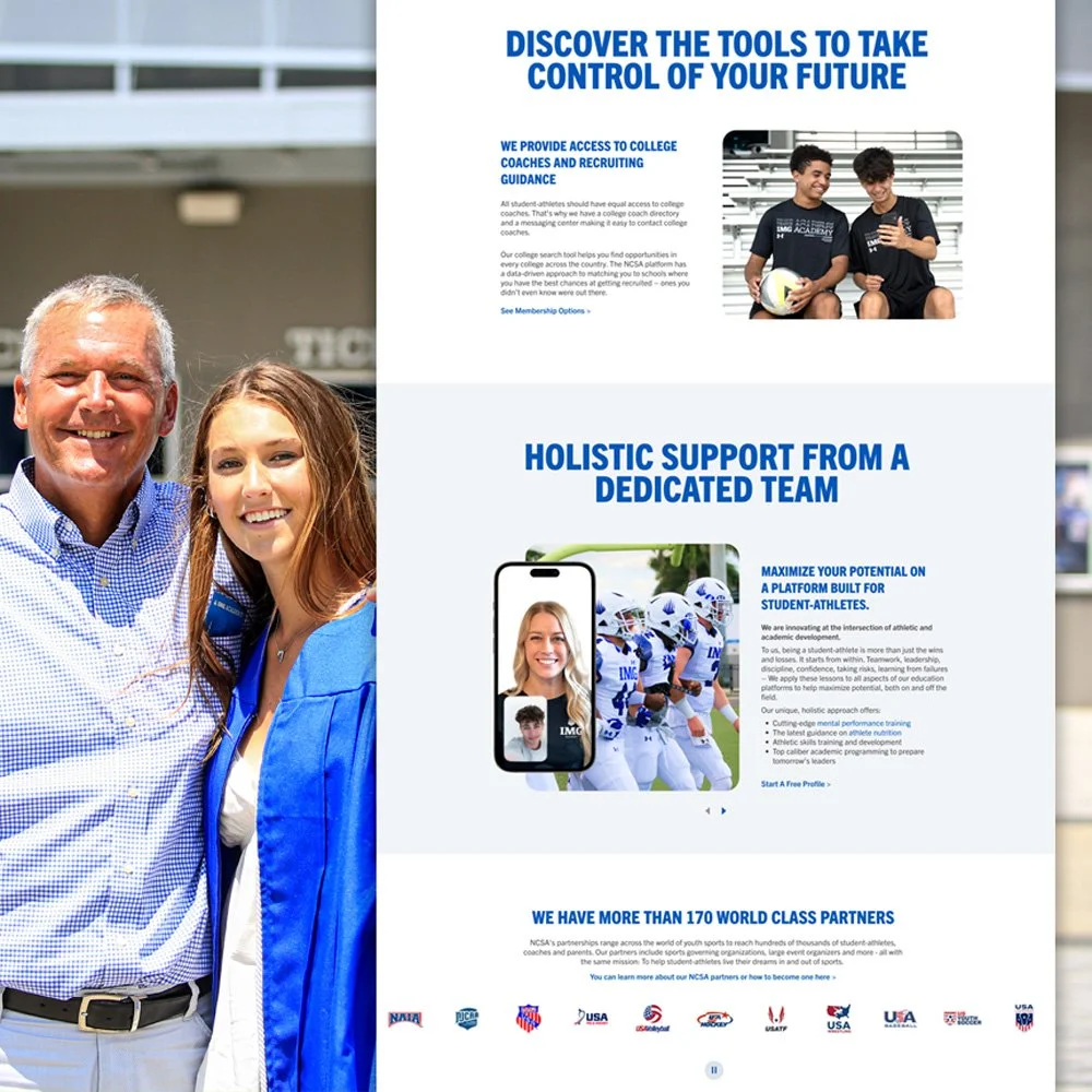
The NCSA About Us page is another trust touchpoint on the website. The page utilizes carousels and scrolling partner logos to showcase tools and trusted organizations that partner with NCSA.
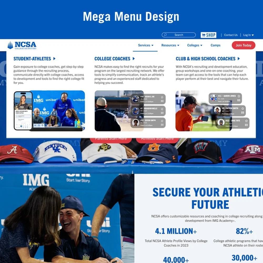
I redesigned the navigation drop down menu to consolidate and better organize key conversion webpages. Images were added to bring the NCSA brand into the menu and give a preview of each page or section.
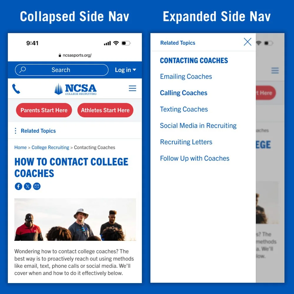
A left mobile sidenav was added to solve for the lengthy interior page side nav that was available on desktop. Originally the mobile side navigation relied on stacked links at the top of each page or created another layer of dropdown under the hamburger menu creating a poor user experience. This left side nav design carried the side nav into mobile seamlessly and in its natural area (left side) that users would be looking for.
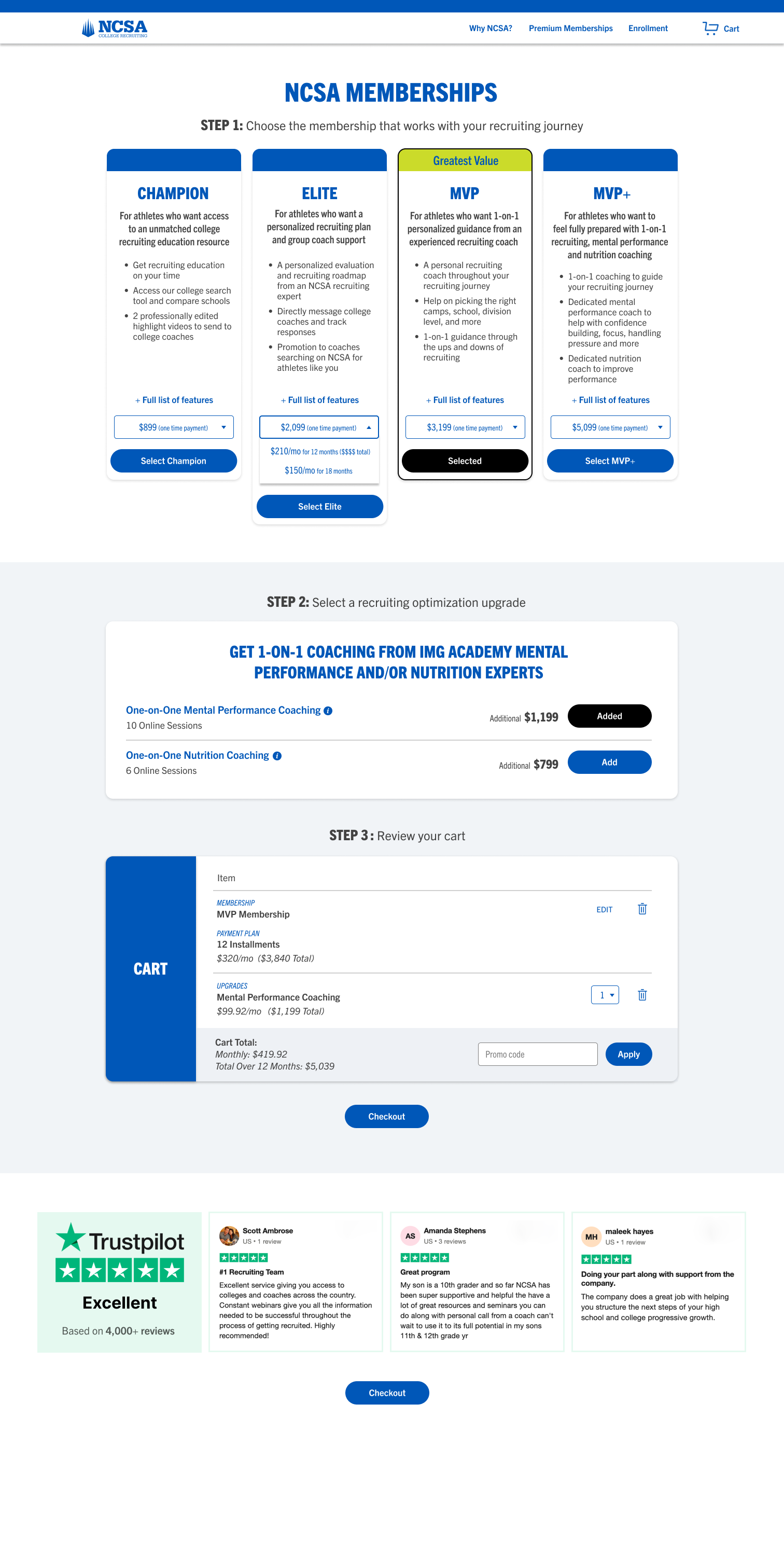
NCSA Membership Table Redesign Project
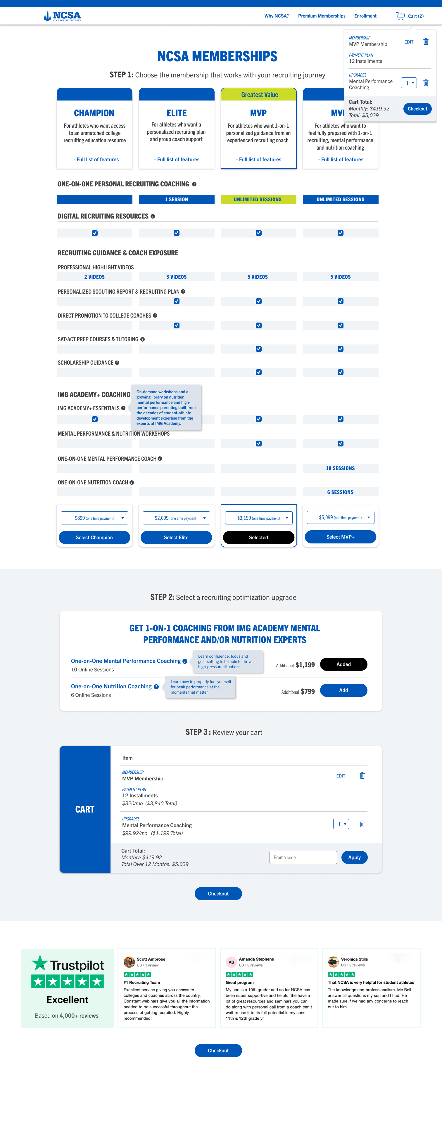
NCSA Membership Table Redesign Project